Background
Quest Oil Group is a value driven energy company with a passion for excellence that provides eco-friendly and innovative services by leveraging skilful and dynamic resources.
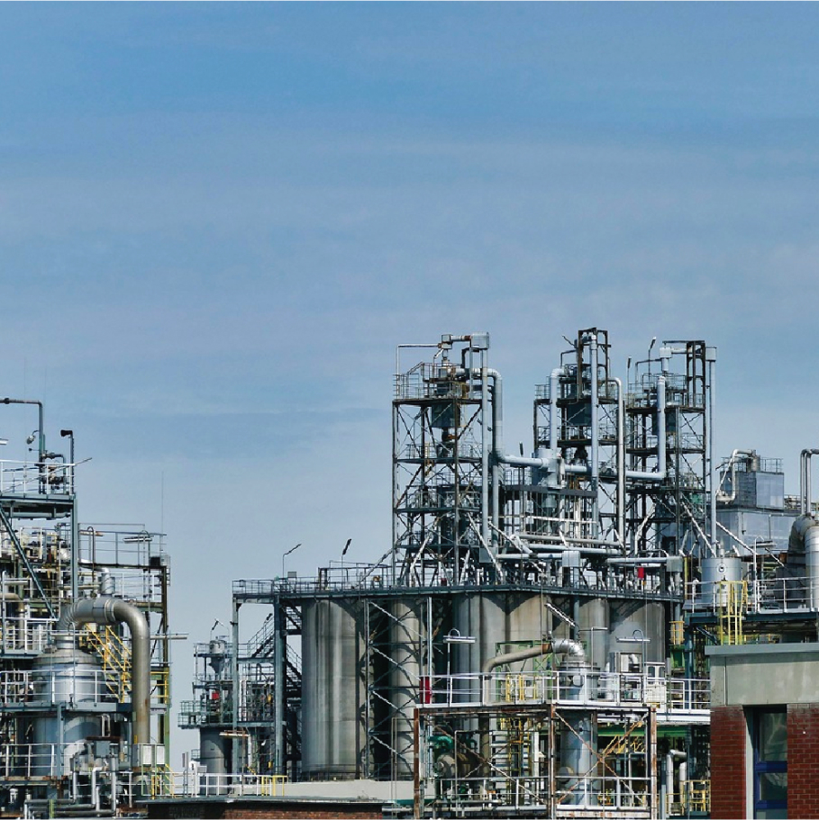
The company offers oil and gas as well as engineering services covering design & development, procurement, steel & fabrication and integration of high-speed, automatic packaging equipment to clients.
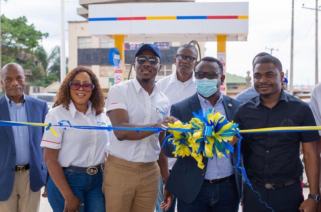
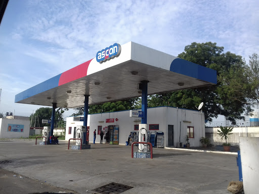
Recognising the need to provide quality products and services extending beyond exploration and engineering, Quest acquired ASCON Oil Company Limited in July 2019 and changed its name to Quest Retail.
Challenge
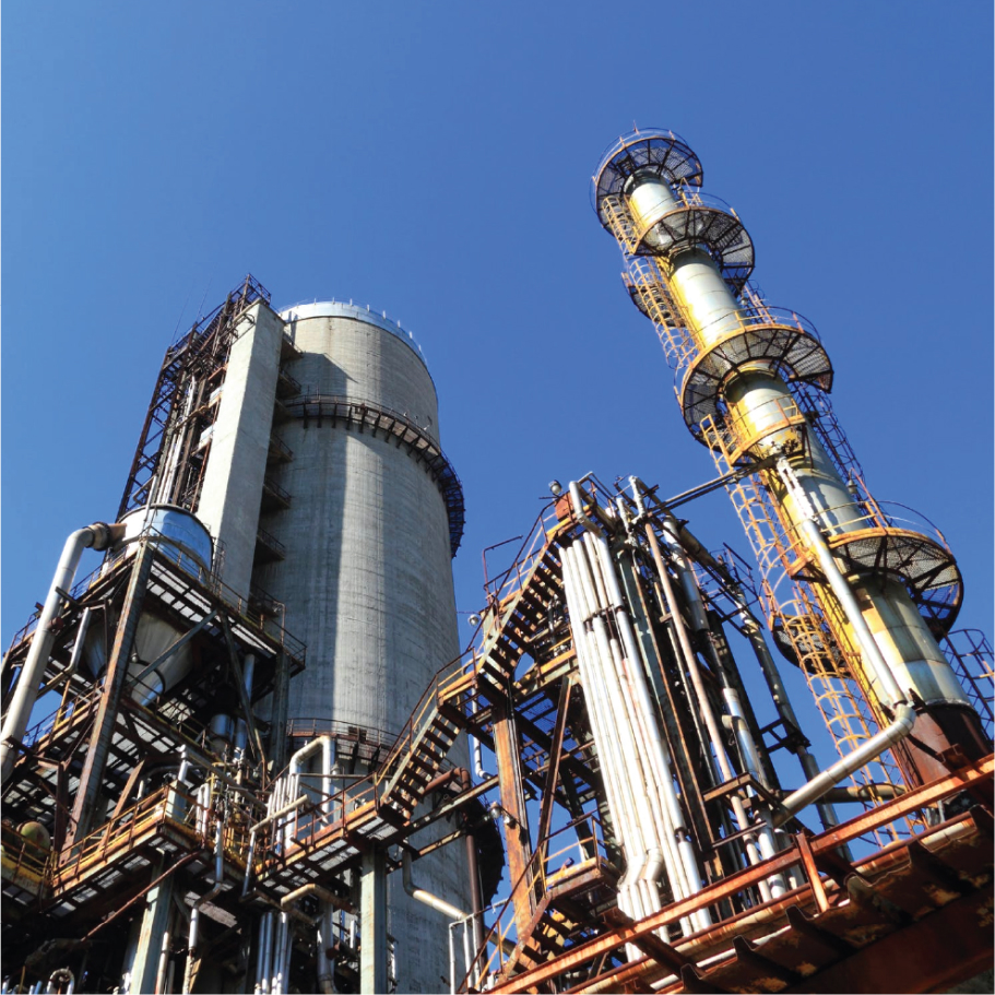
The E in Quest stands for excellence and that is precisely what this brand strives for everyday. Quest had recently taken a bold step with the acquisition of ASCON Oil and was about to reposition itself as a major industry player. They had transitioned from a solely upstream oil company into an Integrated Oil and Gas Company with both upstream and downstream operations.
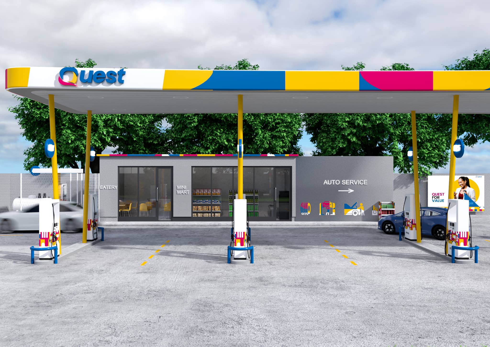
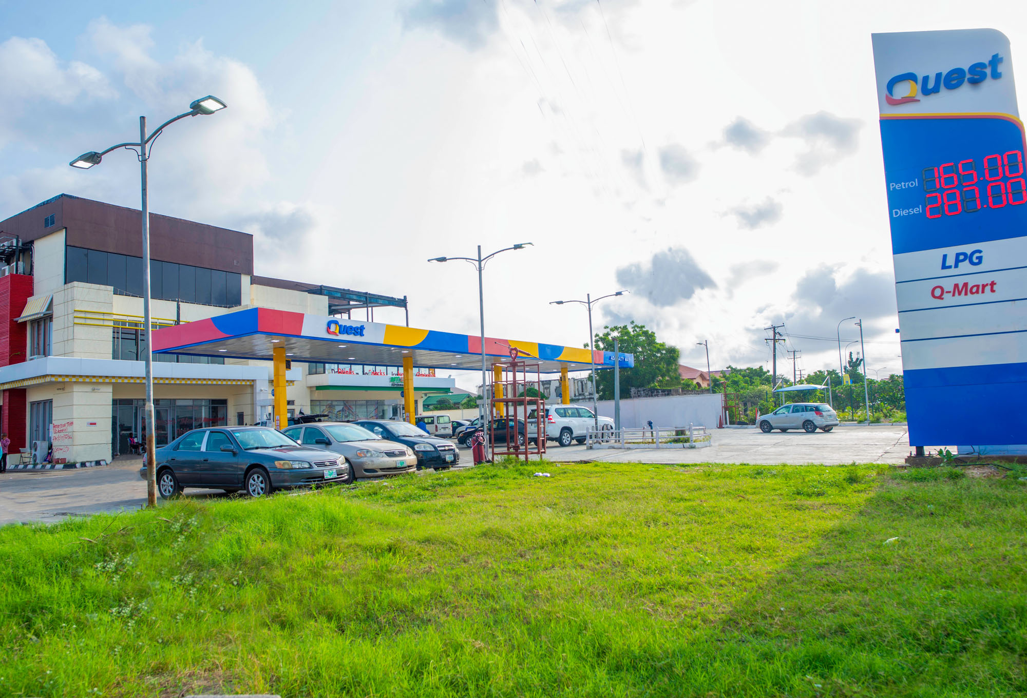
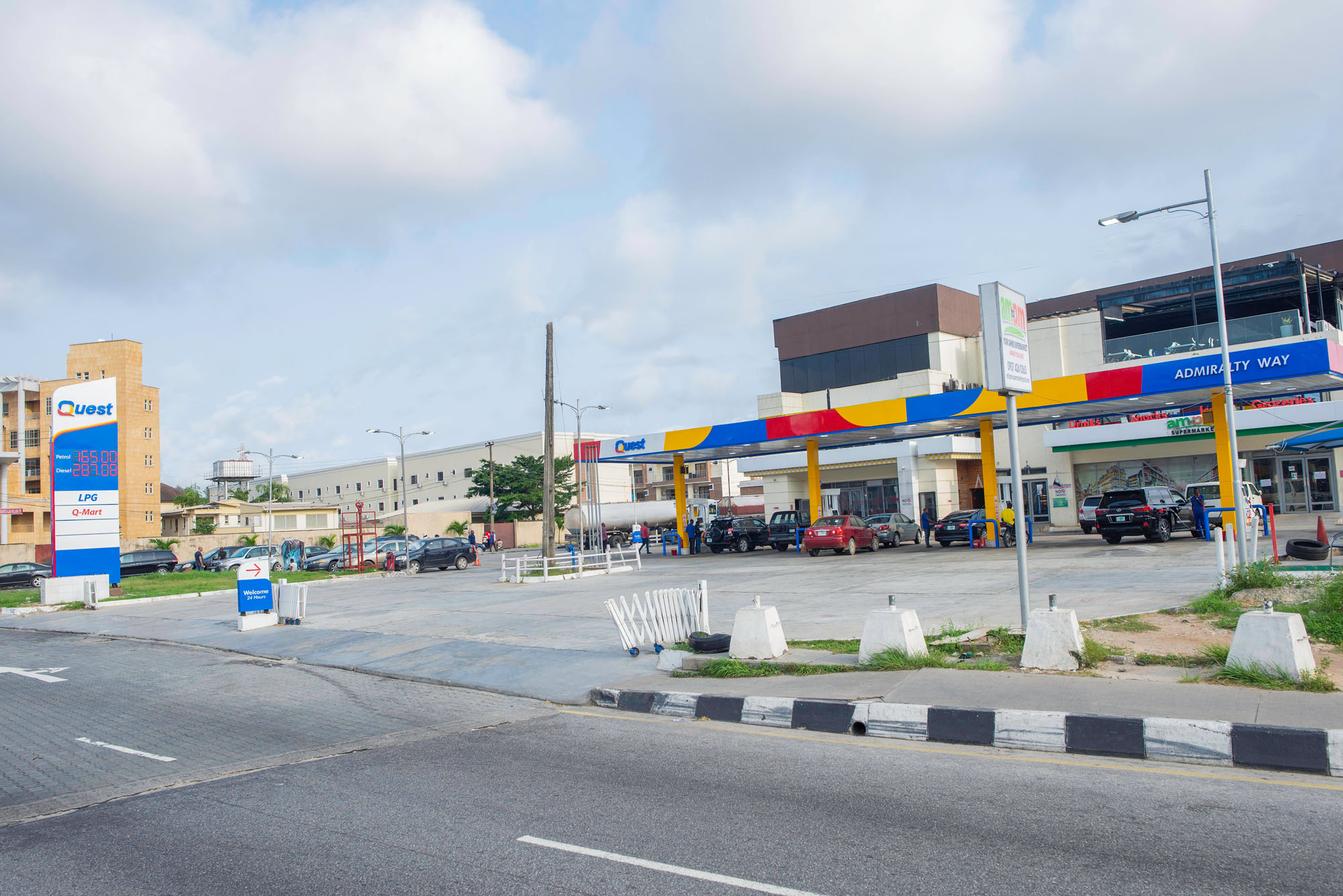
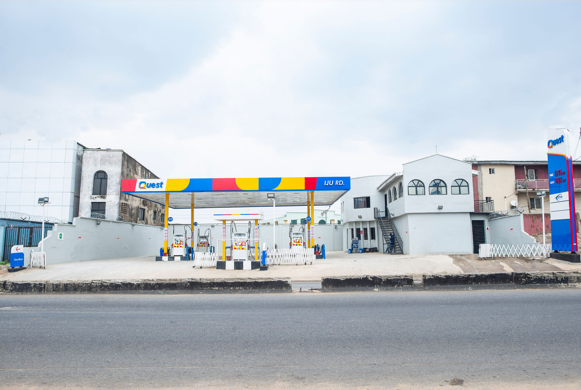
This transition certainly needed a refreshed brand to announce its grand entry, such that other stakeholders would pause and take note. Its acquisition of ASCON Oil meant that its brand identity was now going to be heavily visible through its retail service stations.
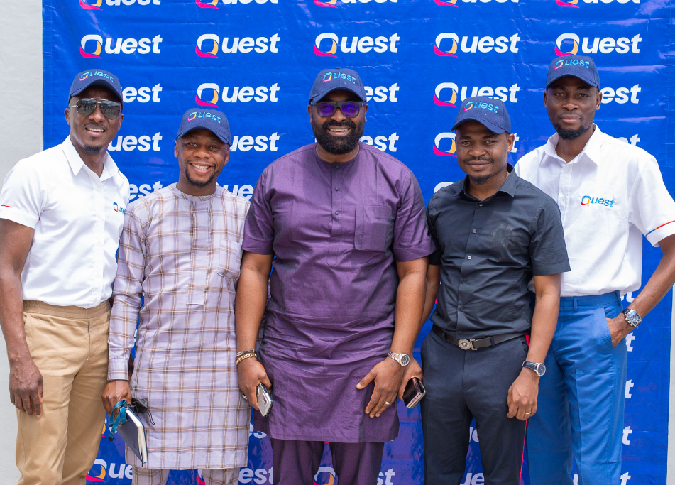
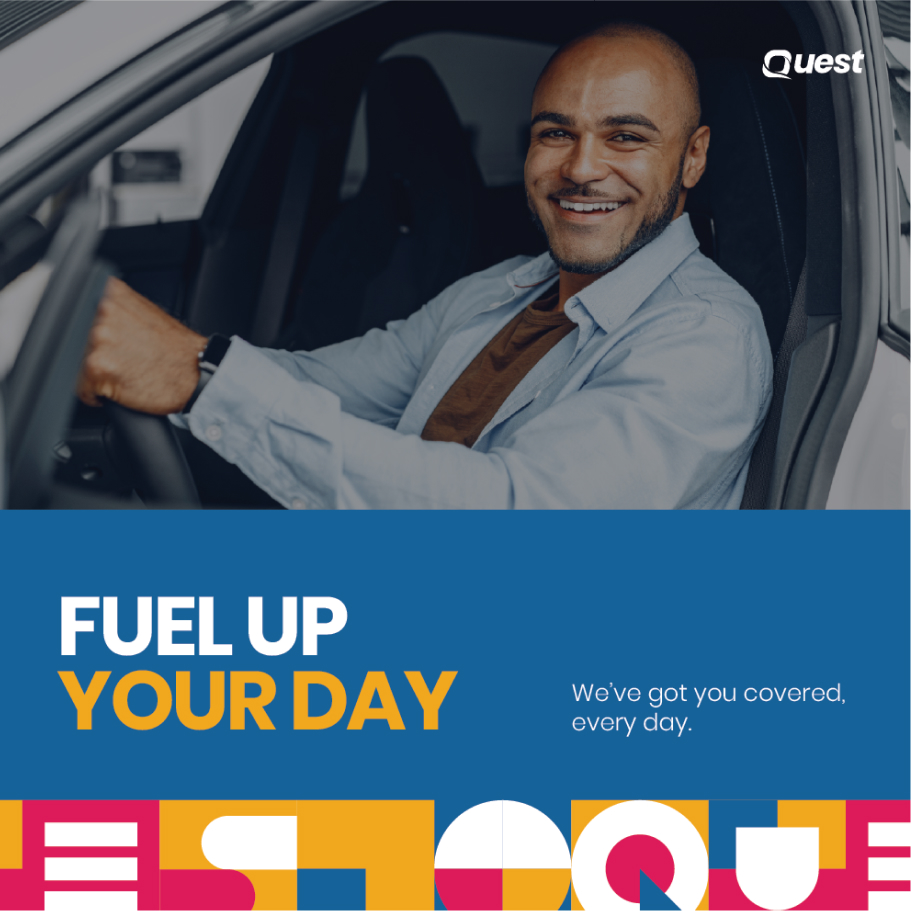
We decided we needed to deliver a revamped identity that would adequately represent the start of a new era for Quest, appeal to a broader demographic and also appeal to new audiences.
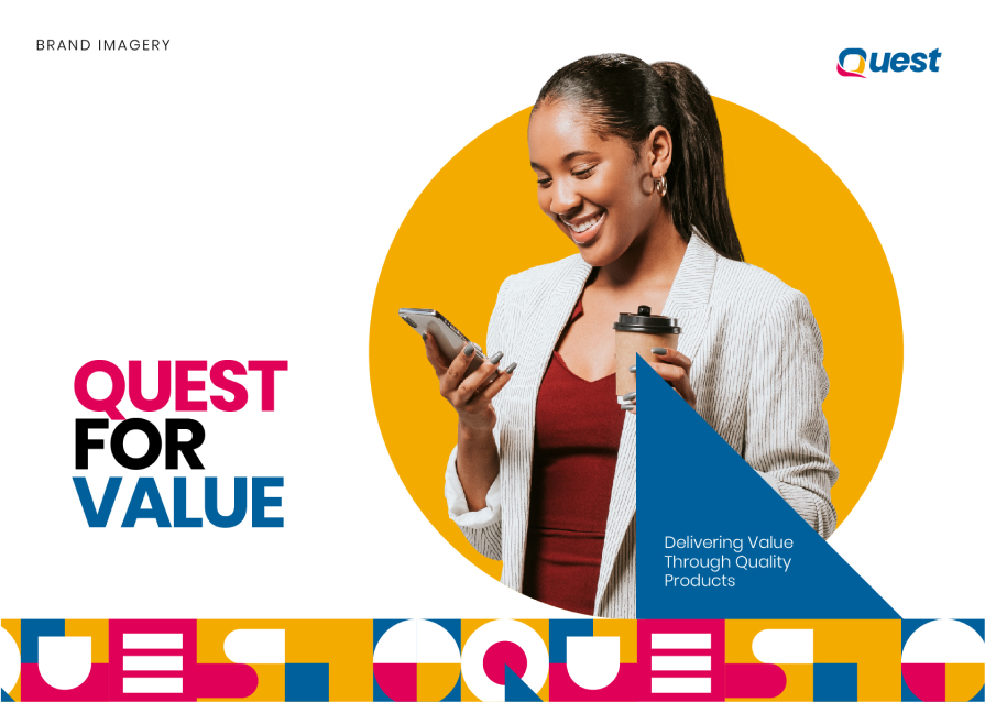
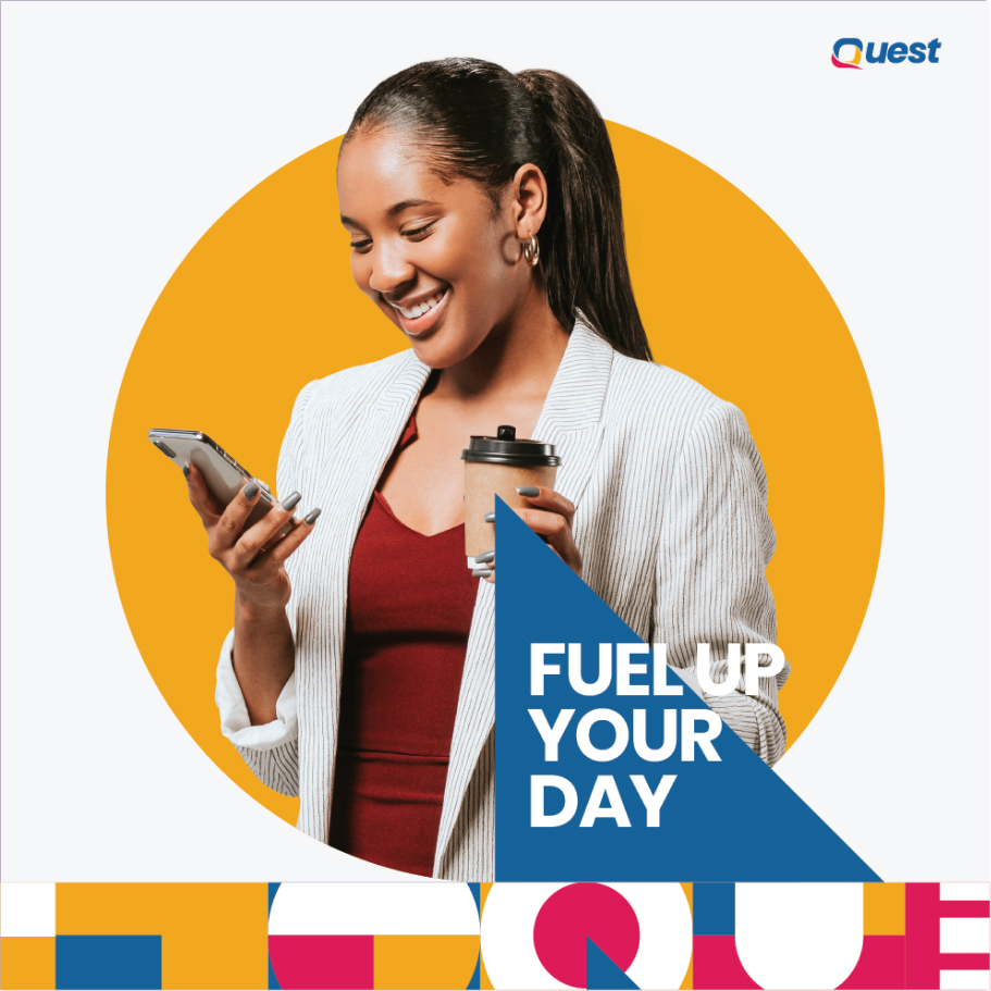
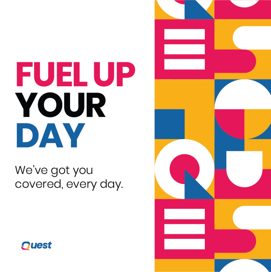
This is not just any fuel station, this is YOUR gas refuel station.
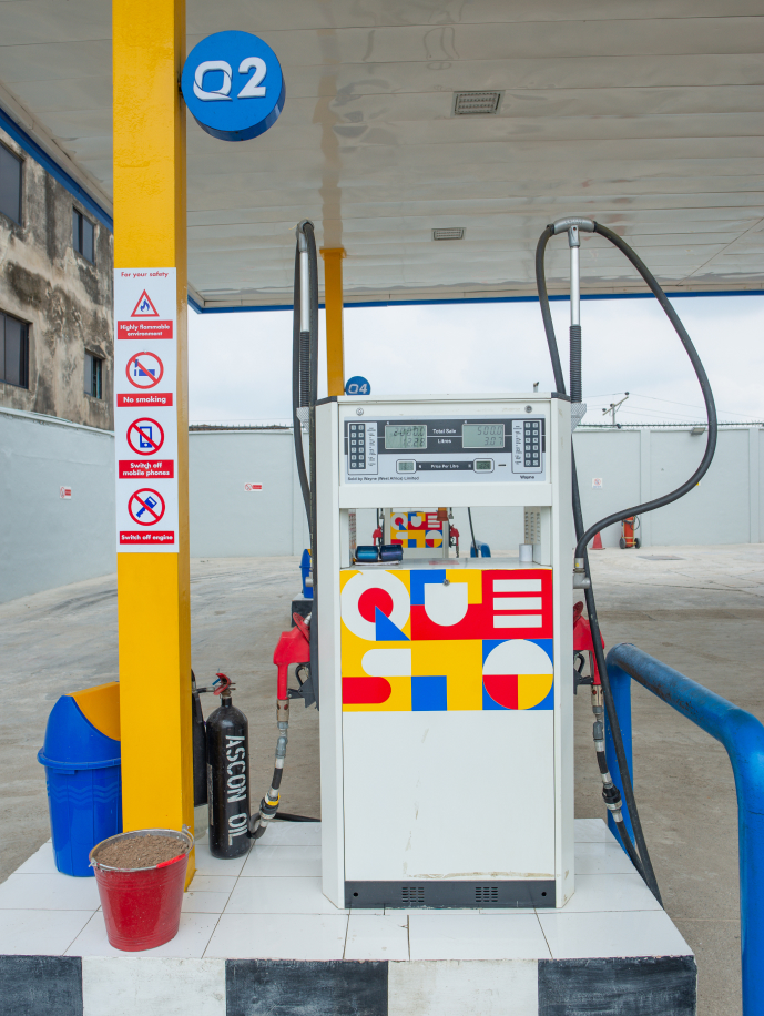
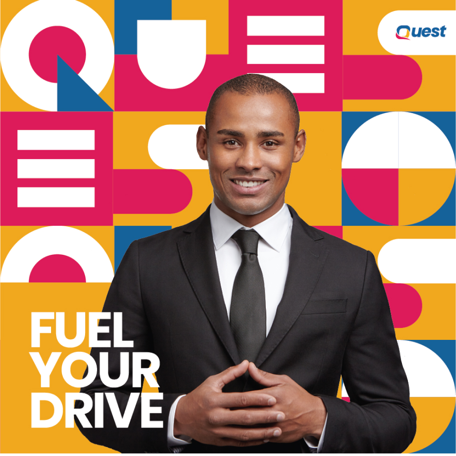
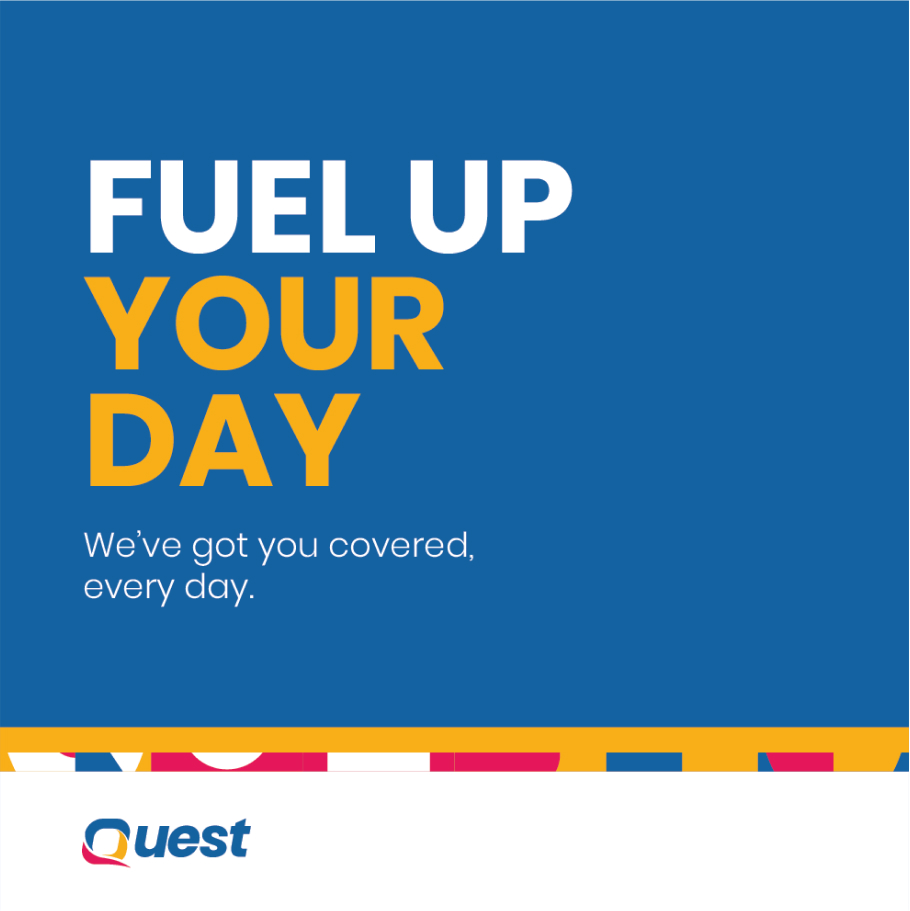
This identity had to be vibrant, remarkable and modern while effectively communicating the core values the Quest brand stands for: Quality, Uniqueness, Excellence, Service and Trust.


Solution
We knew that becoming an industry leader required not only strategic partnerships and acquisitions, but also an identity that was fitting for the title - and that is what we created for Quest.
The revamped brand identity was intentionally designed to communicate a sense of warmth and excitement to the brand's audience; a feeling of inclusion that says,
“This is not just any fuel station, this is YOUR gas refuel station.”
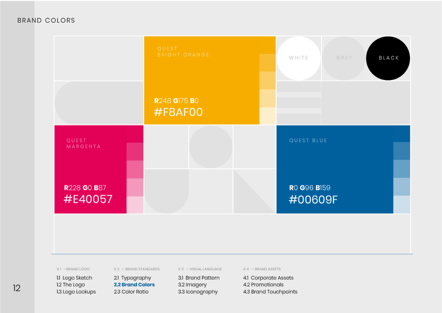
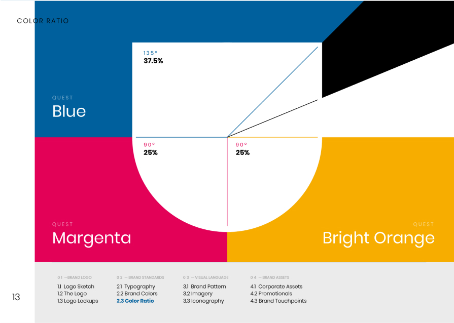
Quest
Margenta
Margenta
R228 G0 B87 #E40057
Quest
BRIGHT ORANGE
BRIGHT ORANGE
R248 G175 B0 #F8AF00
White
Grey
Black
Quest
Blue
Blue
R0 G96 B159 #00609F
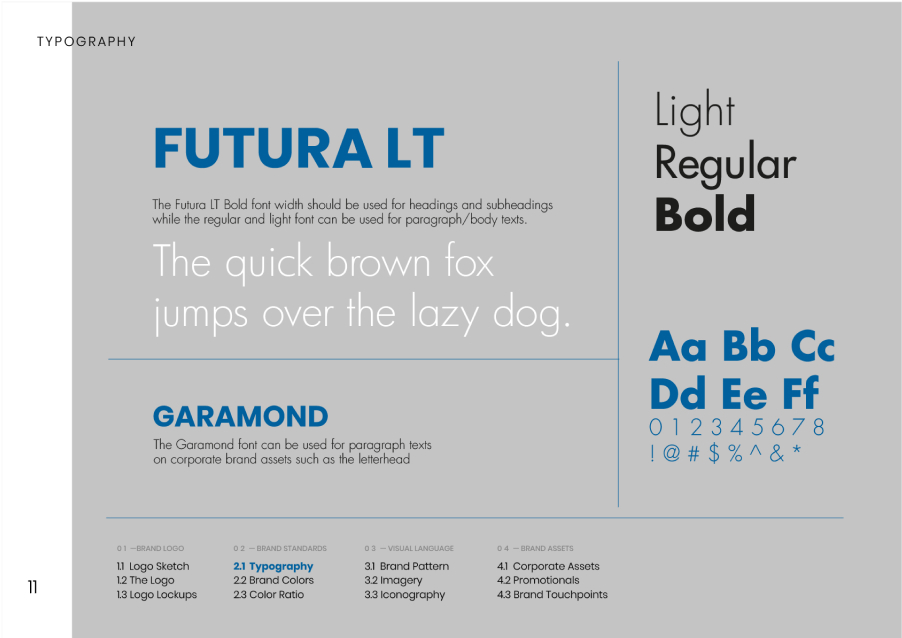
FuturaLT
The Futura LT Bold font width should be used for headings and subheadings while the regular and light can be used for paragraph/body texts.
The quick brown fox jumps over the lazy dog
Garamond
The Garamond font width should be used for paragraph texts on corporate brand assets such as letterheads.
Light
Regular
Bold
Aa Bb Cc Dd Ee Ff
0 1 2 3 4 5 6 7 8 9
! @ # $ % ^ & * ( )
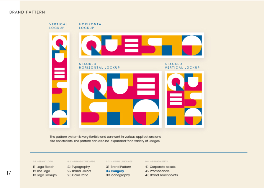
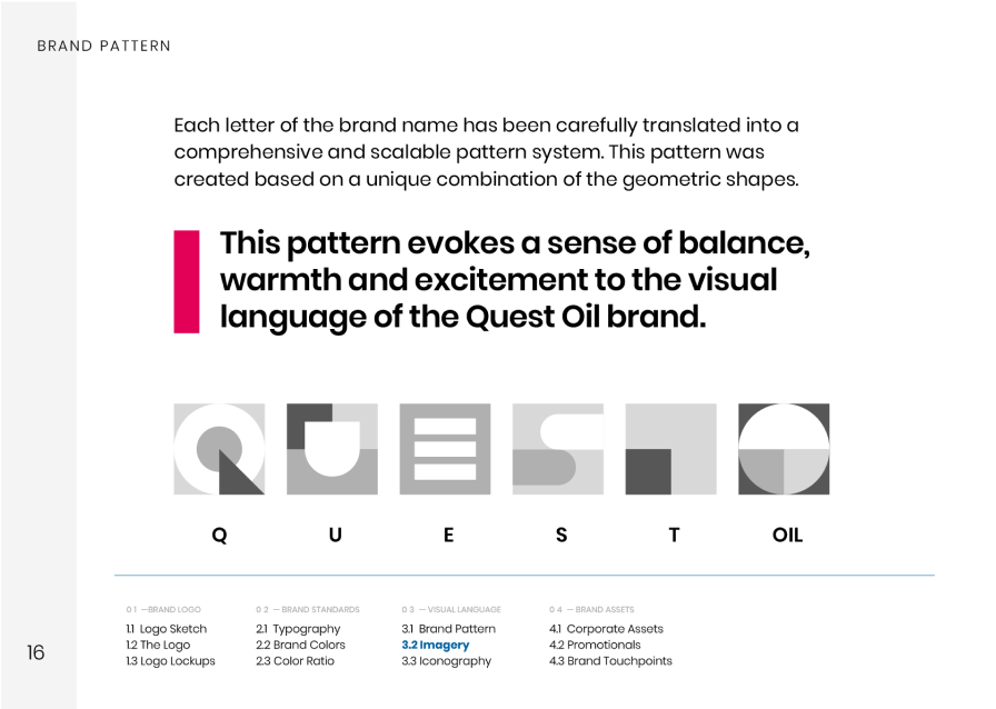
We pulled this off by utilising friendly visuals, vibrant colours, an engaging pattern system and a human-centred approach to photography.
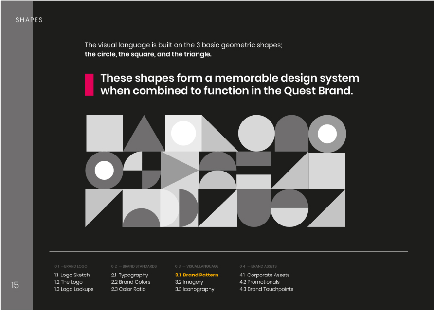
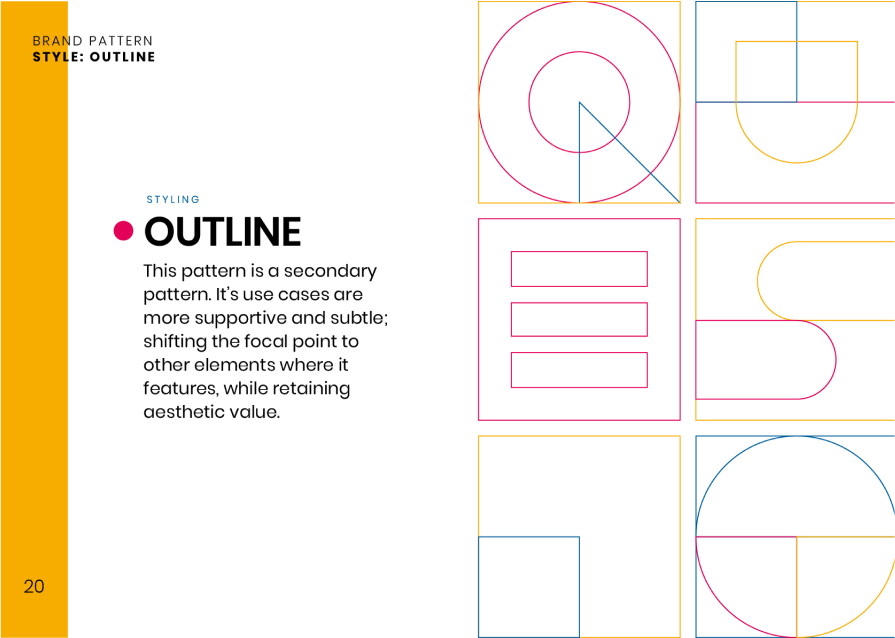
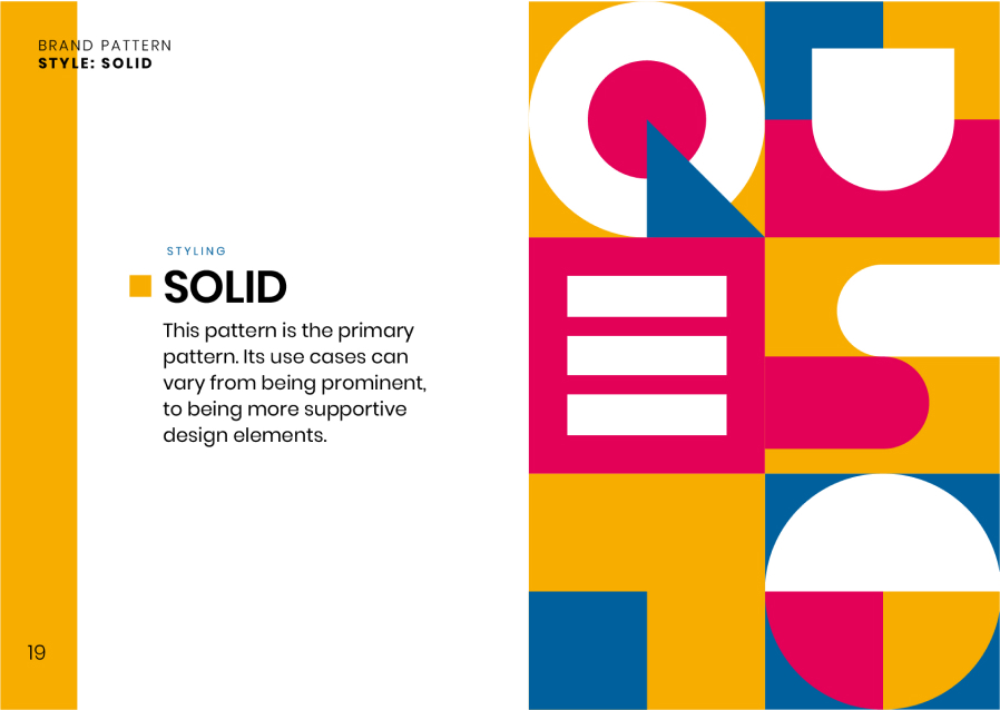
These shapes form a memorable design system when combined to function in the Quest Brand.